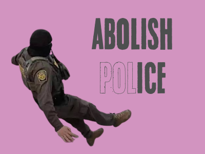
Abolish ICE: Abolish the Police
Some Democrats are cautiously taking on popular calls to abolish ICE by casting it as an anomaly of US policing. But ICE’s violent border enforcement relies centrally on “regular” US police, and the fight to abolish one is inextricably tied to the abolition of the other.

We won’t reform the gestapo
Spare us your talk of body cams.

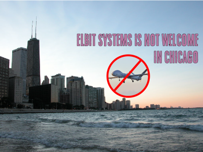
US Out of the Philippines!
The US government, with the collusion of the Philippines ruling class, is attempting to expand its military presence at the expense of the Filipino people while under Trump, Filipino Americans are under threat by the same dynamics. Solidarity can link the struggles at home and abroad.

The Antidote to Fascist Fear
The left faces enormous challenges in the wake of the re-election of Donald Trump. Confronting the fascists will require opening paths of cooperation and cultivating a faith that working people can act collectively for ourselves.

Who Are Our Libraries For?
Chicago’s libraries are vibrant neighborhood centers of learning, rest, and community building. They could offer a glimpse of another kind of world, if we protect and support these spaces and the people who make them run.
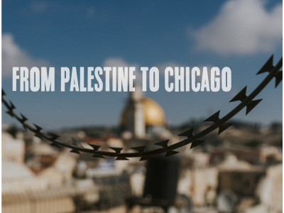
No Reproductive Justice Without Palestinian Liberation
At the “Bodies Outside of Unjust Laws” march that kicked off a week of protest against the Democratic National Convention in Chicago, Chicago for Abortion Rights drew the connections between the need for reproductive justice and Palestinian liberation.

“I knew community was the answer”
An interview with an unstoppable organizer, Gerardo Marciano


Get Rampant in your inbox